
Mobile optimization is the process of ensuring your website looks great and works smoothly on all mobile devices. With Google’s mobile-first indexing and the majority of users browsing via smartphones, it’s essential to prioritize the mobile experience.
🔍 Why Mobile Optimization Is Important
- Google ranks mobile-friendly websites higher.
- Over 60% of web traffic comes from mobile devices.
- A better mobile experience leads to higher engagement and lower bounce rates.
✅ Steps to Optimize Your Website for Mobile
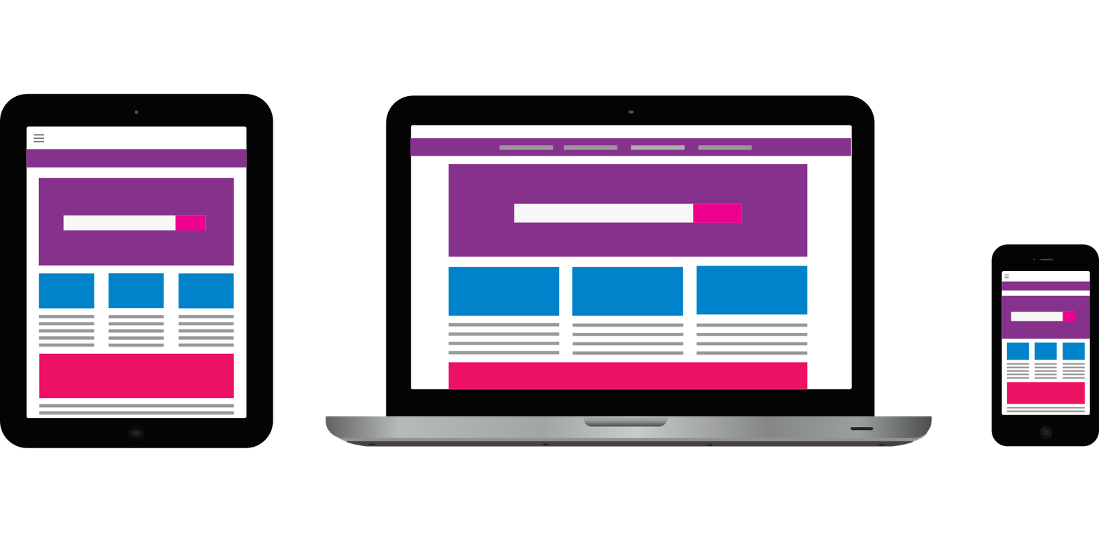
1. Use Responsive Web Design
- Your site should automatically adjust to different screen sizes.
- Use CSS media queries to ensure text, buttons, and images scale properly.
2. Improve Mobile Page Speed
- Compress and resize images.
- Minify HTML, CSS, and JavaScript.
- Enable browser caching.
- Use a content delivery network (CDN).
- Tools: Google PageSpeed Insights
3. Simplify Navigation
- Use a clean, easy-to-tap menu.
- Keep essential pages accessible in 1–2 clicks.
- Avoid pop-ups or intrusive elements on small screens.
4. Use Readable Fonts and Tap-Friendly Buttons
- Use at least a 16px font size for body text.
- Make buttons large enough for finger taps (minimum 48x48px).
5. Optimize Images for Mobile
- Use responsive images that scale based on screen size.
- Choose fast-loading formats like WebP or AVIF.
6. Avoid Flash and Heavy Scripts
- Flash is not supported on most mobile devices.
- Use modern HTML5 for animations and interactive elements.
7. Test on Multiple Devices
- Check your site on various phones and tablets (iOS & Android).
- Use Google’s Mobile-Friendly Test tool.
📈 Bonus Tip: Monitor and Improve
- Track mobile performance in Google Search Console and Google Analytics.
- Regularly update your site for speed, functionality, and SEO.
📣 Final Thoughts
A mobile-optimized website isn’t just about rankings—it’s about giving users the best experience. By following these steps, you’ll improve performance, boost visibility, and keep visitors coming back.